Service 06 of 10
Branding & Design
A brand identity and a Shopify or WordPress store design your developer can actually build — logo to Figma file, not a mood board.
Built on
- Figma
- Shopify
- WordPress
- HTML
- CSS
 06 · Design & build
Not sure this is the one you need?
If the store looks fine and still does not sell, the problem is rarely the logo.
A fixed-fee audit measures speed, the product page and the checkout before anyone spends money on a new look.
Start with an audit- From
- $499
- Pricing
- 3 published tiers
- First reply
- Within one business day
250+ Brands shipped
Since 2024.
85+ Storefronts maintained
Themes, apps and Hydrogen.
1.5s Median LCP after rebuild
Mobile field data, not a lab score.
1 day To a real first answer
One business day. A plan, not a deck.
Who this is for
Who Branding & Design is for
Your logo was made in an afternoon and the business outgrew it.
It blurs at favicon size, there is no version that works on a dark background, and the colours shift every time someone exports it. Every new channel you open exposes it again.
The brand looks different everywhere it appears.
The store, the packaging, Instagram and the invoices were each made by a different person from a different file. Nobody can say which green is the real one, because nobody ever wrote it down.
You have mock-ups that no developer will quote with confidence.
Flat images at one width, no mobile, no type scale, no states. The quote comes back high because whoever builds it has to invent half the design while they build it.
The argument
A brand has to survive being built
Most brand work is judged at the size it is presented: a large logo on a clean slide, a palette laid out in generous squares, a mock-up of a shopping bag. Very little of a small brand’s life is spent at that size. It is spent at 16 pixels in a browser tab, in one colour on a shipping label, reversed out of a dark product photo, and squeezed into the header of a store on a 390-pixel phone.
An identity that only works large is not finished. So we test the small, awkward uses first, and approve the large version last. If the mark cannot be read as a favicon, it gets redrawn before anyone sees it on a poster.
The same applies to the store. A design that exists only as full-page images at one desktop width is a picture of a website, not a plan for one. Whoever builds it has to guess what happens on a phone, what the type does at every size, and what a product card looks like when the name runs to three lines. Those guesses are where budgets and timelines go.
What we design
Identity. A primary logo, a secondary mark and a favicon, drawn as vectors. A palette with values for screen and print, and a type pairing of two families at most, chosen for how they render and load on the web as much as for how they look.
Guidelines. The written rules that let someone who was never in the room use the brand correctly: clear space, minimum sizes, colour roles, the type scale, what not to do with the logo, and a short note on tone of voice. On Brand Starter this is a one-page sheet; on the larger tiers it is a full document, kept as both a PDF and a page in the Figma file.
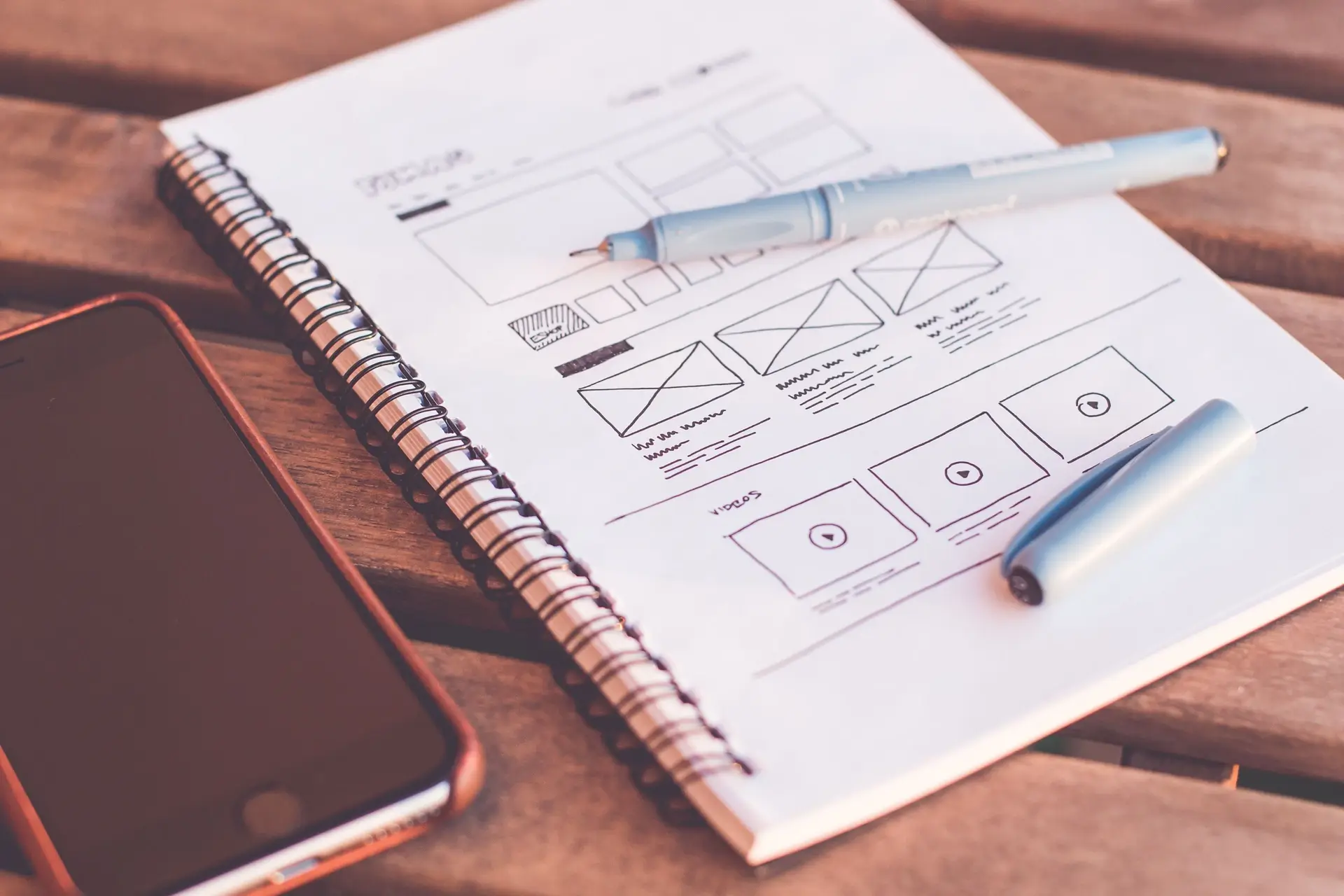
Store and site design. Home, collection and product templates in Figma, at mobile and desktop widths, with the states that real catalogues produce — sale prices, sold-out variants, long names, empty collections. Drawn for Shopify or WordPress, depending on what the store runs on.
A full UI system. On the Full Brand System tier, a complete component library with variables for colour, type and spacing, plus packaging artwork and a social template kit built from the same system, so the box, the post and the product page all look like one business.
Why the Figma file decides the build cost
How a design file is built changes what it costs to turn into a store, and it is worth being direct about that. A file with defined variables, real components and stated breakpoints becomes a theme’s token layer and section inventory almost directly. A file that is a stack of flat images needs a developer to infer the system first — what the type scale is, what the spacing rules are, how a component behaves when its content changes. That inference is design work, done by someone who is not a designer, and it is usually billed as development.
So the files we hand over are organised the way a developer reads them. Colours, type and spacing are variables, not values typed into each layer. Repeated elements are components with their variants defined. Every template has a mobile and a desktop frame. When our own Shopify theme team builds from the file, there is no translation step between design and build, and when someone else’s team does, they get the same file.
The tests a logo has to pass
Before a mark is approved, it has to pass a short list of practical checks. It has to be legible at 16 by 16 pixels, because that is how most people will see it in a browser tab or a bookmark. It has to work in a single colour, for stamps, embossing and shipping labels. It has to work reversed, on a dark photo or a dark footer. And it has to sit comfortably in a narrow store header on a phone without shrinking to nothing.
Colour has its own test. Every pairing of text and background that the guidelines allow is checked against WCAG AA: a contrast ratio of at least 4.5 to 1 for body text, and 3 to 1 for large text and interface elements such as buttons and form borders. A colour that fails is not banned outright; it is restricted in the guidelines to the sizes and uses where it passes. That is what stops a pale brand colour from becoming unreadable button text six months after launch.
When a rebrand is the wrong answer
If the store looks fine and customers still leave without buying, a new identity is rarely what fixes it. The cause is far more often a slow product page, unclear delivery costs, or a checkout with one step too many — and those are cheaper to fix and quicker to measure than a new logo. Our fixed-fee audit finds which, in writing, before you commit to a rebrand.
A rebrand also discards whatever recognition the current brand has earned. If customers already know your mark, a refresh is often the better call: redraw it cleanly, tighten the palette, choose proper type and write the rules down. The honest case for a new identity is a business that has changed what it sells or who it sells to, or a mark that simply cannot be used where the business now needs it. We will say which one we think you are at the brief.
What you get, and who owns it
On final payment, the artwork and the Figma source are yours, transferred to your account rather than held by us. You get logo files in SVG, PNG and PDF in full colour, one colour and reversed; a palette with HEX, RGB and CMYK values and the approved pairings; the type pairing, with font files or licence links; and the brand sheet or guidelines for your tier.
On the store tiers you also get the Figma templates and component library, and a walkthrough with whoever builds the theme or site, so the person writing the code hears the reasoning from the person who drew it. If they still have to guess, we did not finish the job.
What we do
What Branding & Design covers
- 01
Logo and identity
A primary logo, a secondary mark and a favicon, drawn as vectors and tested small, in one colour and on dark before anyone falls in love with the large version.
- 02
Colour and type
A palette and a type pairing chosen for the places the brand actually appears — a phone screen first — with every text pairing checked for contrast before it is approved.
- 03
Brand guidelines
The written rules: how the logo is used and misused, which colour goes where, the type scale, tone of voice. Short enough that the next designer reads it.
- 04
Store and site design
Home, collection and product templates in Figma, at mobile and desktop, with the awkward states drawn — long product names, sale prices, empty collections.
- 05
Figma UI system
Components and variables for colour, type and spacing, organised so a developer can turn the file into a token layer rather than measuring screenshots.
- 06
Packaging and social kit
Packaging artwork for the formats you sell in and a set of social templates, built from the same system as the store so they look like one business.
What you get
Everything on this list is a thing you can open.
Deliverables, not adjectives — 8 artefacts, each one a file, a repository or a document.
- Logo files in SVG, PNG and PDF — full colour, one colour and reversed
- A favicon and social profile mark, tested at the sizes they are shown
- A palette with HEX, RGB and CMYK values and the approved text pairings
- A type pairing with the font files or licence links for each family
- A one-page brand sheet, or full brand guidelines as a PDF and a Figma page
- Figma designs for the home, collection and product templates, at 390 and 1440 pixels
- A Figma component library with colour, type and spacing variables
- Packaging artwork and social templates, on the Full Brand System tier
Technically
What a Vibhora brand file is actually made of.
- Identity
- Primary logo, secondary mark and favicon, drawn as vectors and approved at 16 pixels before they are approved at poster size
- Colour
- A palette defined as Figma variables, every text and background pairing checked against WCAG 2.2 AA
- Type
- Two families at most, chosen for how they render and load on the web, licensed for the uses you need
- Store design
- Home, collection and product templates at 390 and 1440 pixels, with long-content, sale and empty states drawn
- Handover
- A Figma file organised as components and variables, transferred to your account, with every export in a folder you keep
- When we say no
- If the store's problem is conversion or speed, we say so and point you to an audit instead of a rebrand
Acceptance criteria, every project
- body text
- ≥ 4.5:1 contrast WCAG AA
- UI and large text
- ≥ 3:1 contrast WCAG AA
- favicon
- legible at 16 × 16 px
- logo files
- SVG, PNG, PDF colour, mono, reversed
- revisions
- 2 rounds per stage
Contrast is measured on the final palette pairs in the Figma file, and a pair that fails is either changed or restricted in the guidelines to the sizes where it passes. Revision rounds are counted per billing stage — on Brand Starter the two stages are the logo and the brand sheet — and a further round is quoted before it starts.
Brands we build and maintain for




How it runs
The order matters more than the estimate.
Brief
Who buys from you, where the brand appears, what already exists and what it will be built on. A brand designed without knowing the platform tends to be redesigned when it meets it.
Direction
Two directions, each shown applied — a product page, a package, a post — rather than as a mood board. You choose one, and the reasons get written down.
Identity
Logo, palette and type refined on the chosen direction, then tested at favicon size, in one colour, on dark and next to your own product photography.
Guidelines
The rules that keep the brand consistent once we have gone — usage, spacing, colour roles, the type scale and tone of voice — written for whoever designs the next thing.
Store design
Templates in Figma, mobile first, built from components and variables so every screen uses the same system the guidelines describe.
Handover
Files transferred to your account, exports organised, and a walkthrough with whoever builds the theme or site — ours or someone else's.
The honest part
When a rebrand is the wrong answer
A new identity is an expensive way to fix a store that is slow, confusing or hard to check out on. If customers arrive and leave without buying, the cause is far more often the product page, the delivery information or the load time than the logo — and those are cheaper to fix and quicker to measure. A rebrand also throws away whatever recognition the current brand has earned. If people already know your mark, a refresh — redrawn, a tighter palette, proper files and written rules — usually keeps what works and fixes what does not. The honest case for a new identity is a business that has changed what it sells or who it sells to, or a mark that cannot be used where the business now needs it. We will tell you which one you are.
If the store looks fine and still does not sell, the problem is rarely the logo.
Built with
The full stackTools and platforms
- Figma
- Shopify
- WordPress
- HTML
- CSS
Questions
What people ask before they commission this.
What files do we get with a logo design?
Vector files in SVG and PDF for print and for the web, and PNG exports at common sizes, each in full colour, one colour and reversed for dark backgrounds. You also get a favicon and a square profile mark, because a logo designed only for a wide header usually fails at the sizes it is shown most often. Every file is in a folder you keep, and the Figma source is transferred to your own account.
Can the store designs be built as a Shopify theme?
Yes — that is the reason they are drawn the way they are. The Figma file uses components and variables for colour, type and spacing, sets out mobile and desktop widths, and draws the awkward states such as long product names, sale prices and empty collections. A Shopify developer can turn that into a theme's token layer and section inventory directly, rather than inferring a system from flat images. Our Shopify theme development service builds from exactly this file.
Do you design for WordPress sites as well as Shopify stores?
Yes. The identity work is the same for both, and the site designs are drawn as reusable blocks and patterns rather than one-off pages, which is how a WordPress block theme is built. The palette and type scale map onto a theme.json file, so the brand system becomes the site's design settings rather than a set of colours someone types in by hand.
Do we own the logo and the design files?
Yes. On final payment the artwork and the Figma source files are yours, transferred to your account rather than held by us. The one exception is typefaces: a commercial font is licensed, not owned, and the licence is bought in your name so it stays with the business. Where a free, openly licensed family does the job, we recommend it and there is no licence to buy.
How many revisions are included?
Two rounds of revisions at each stage of the project. On Brand Starter that means two rounds on the logo and two on the brand sheet; on the larger tiers it means two rounds at each of the three milestones. A further round is possible, and it is quoted before it starts rather than added to the final invoice.
Can you refresh our existing logo instead of starting again?
Often that is the better option. If customers already recognise the mark, redrawing it cleanly as a vector, tightening the palette, choosing a proper type pairing and writing the rules down keeps the recognition you have earned and fixes the practical problems. We say at the brief stage whether a refresh or a new identity is the honest recommendation.
What do you need from us to start?
Whatever exists today — current logo files, a few screenshots of the store, packaging photos — plus the store or site URL, two or three brands you admire and why, and an hour for the brief. If you know which platform the store will be built on, say so, because it changes how the designs are organised for the developer.
Often scoped together
All ten servicesMost of this work arrives with something next to it.
 01
Shopify Theme Development
The Figma file from Brand & Store Design is the file the theme is built from, with no translation step in between.
From $999See the service 04
WordPress Development
The same palette and type scale, built as a block theme with theme.json carrying the system.
From $799See the service 08
Paid Ads & Performance Marketing
Ads work better when the creative looks like the store it lands on, and the guidelines give the ad work a system to draw from.
From $499/moSee the service
Send the store URL and whatever the brand is today.
Logo files, a screenshot, a photo of the packaging — whatever exists. One business day, one real answer: whether you need a new identity, a refresh of the one you have, or something other than design entirely.
Prefer to talk first? Book a free 30-minute call (opens in a new tab) No pitch; nothing is billed before a written scope.