
01 / TattooMyShoes
A 40-second storefront, rebuilt around the buying decision.
- CRO & buyer journey
- Ecommerce architecture
- Product & customisation UX
- Performance
TattooMyShoes sells wearable versions of real tattoo artists' work. On Wix, the storefront could take 40 to 50 seconds to become usable, every design sat in one flat catalogue, and the product page asked customers to commit before it had helped them choose. We rebuilt the speed, the journey, the product decision and the artist architecture together, because none of them works on its own.
- Observed LCP
- 40–50s
- Platform, before
- Wix
- Ways into the catalogue
- One flat grid
- Artist attribution
- None in the data
Colophon
- Client
- TattooMyShoes
- Industry
- Custom footwear
- Engagement
- Ecommerce rebuild — performance, CRO, UX and architecture
01 / Problem
The artwork was never the problem.
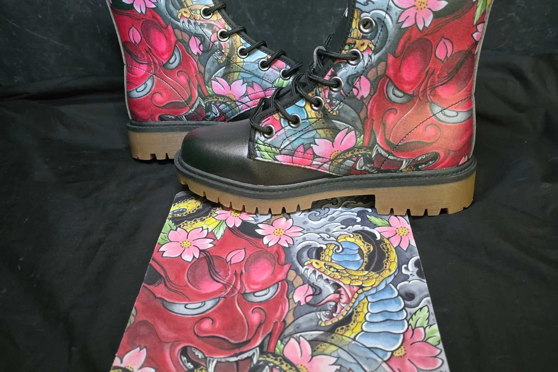
TattooMyShoes · Hannya and Snake, boots and original flash
TattooMyShoes sells something genuinely hard to find: footwear carrying the work of real tattoo artists. The catalogue was strong, and the identity that artwork gave the product was the one thing about this business that never needed fixing.
The store around it was.
Low sales were the symptom everyone could see. What the analysis found underneath was an ecommerce experience working against its own product: a storefront that took most of a minute to become usable, a catalogue with no way in other than scrolling, and a product page that asked for a purchase before it had helped anyone make a choice.
None of those failures was independent. A visitor who waits forty seconds never reaches the artwork. A visitor who reaches the artwork cannot find more by the artist who made it. A visitor who finds a product cannot tell what they are actually choosing between. Each one was leaking the customers the one before it had managed to keep.

- 01 / Sales
Three to four orders
The whole of a one-to-two month stretch, at the low point.
- 02 / Performance
40 to 50s to LCP
Observed on the old Wix storefront, at its worst.
- 03 / Discovery
One flat catalogue
Every design in a single grid, with no artist-led way in.
- 04 / Attribution
None in the data
No structure for tying a sale to an artist, a collection or a design.
Before
What a customer used to arrive at.
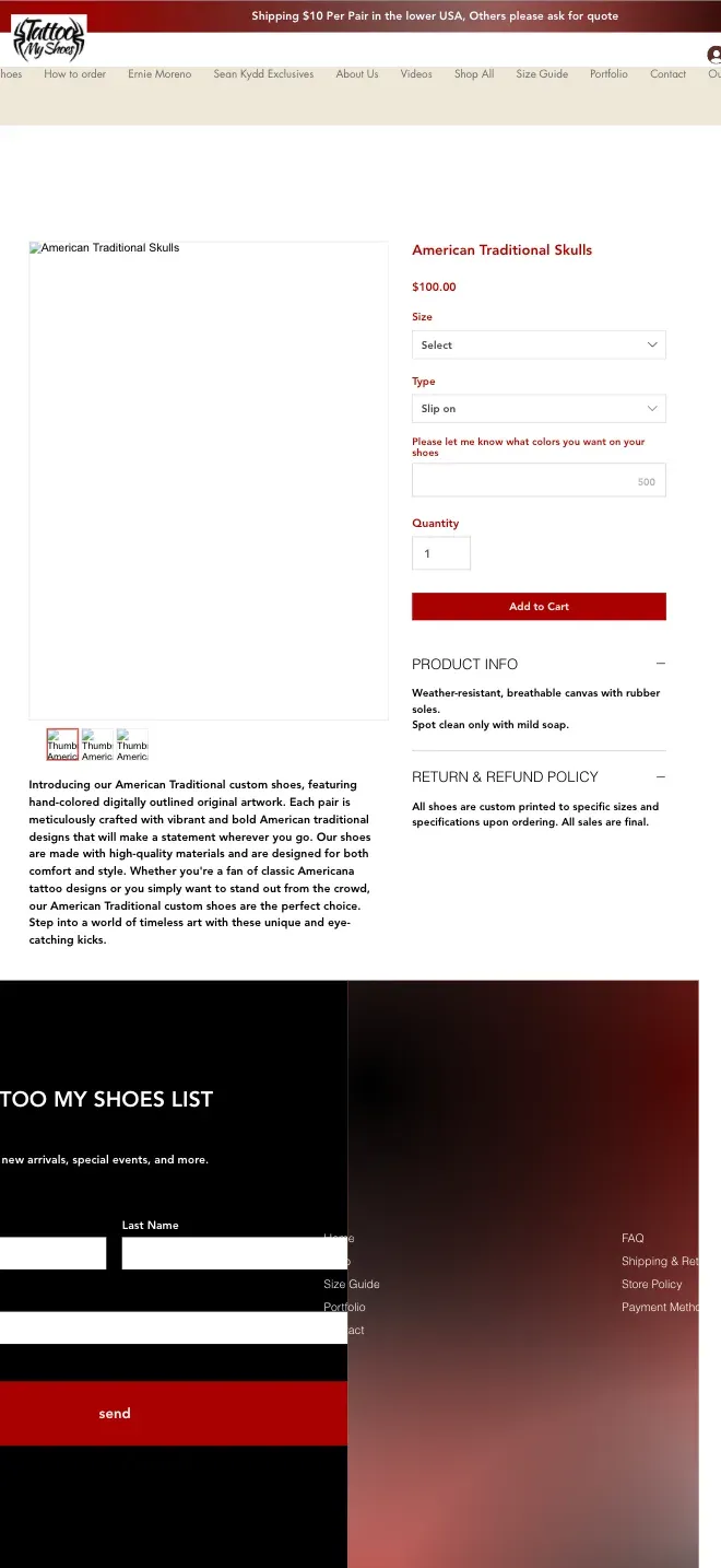
The old site ran on Wix and looked like it: a general-purpose ecommerce template with tattoo art dropped into it, rather than a store that belonged to the work it was selling.
For an audience that follows artists the way other people follow brands, that was a commercial problem and not only an aesthetic one. Nothing in the interface signalled that these were real artists' designs, nothing invited exploration, and every path through the catalogue ended at the same flat grid.
What the customer saw
A general-purpose ecommerce template with tattoo art dropped into it.
Why it mattered
Nothing on the page said these were real artists' designs — so nothing invited anyone deeper than the first screen.
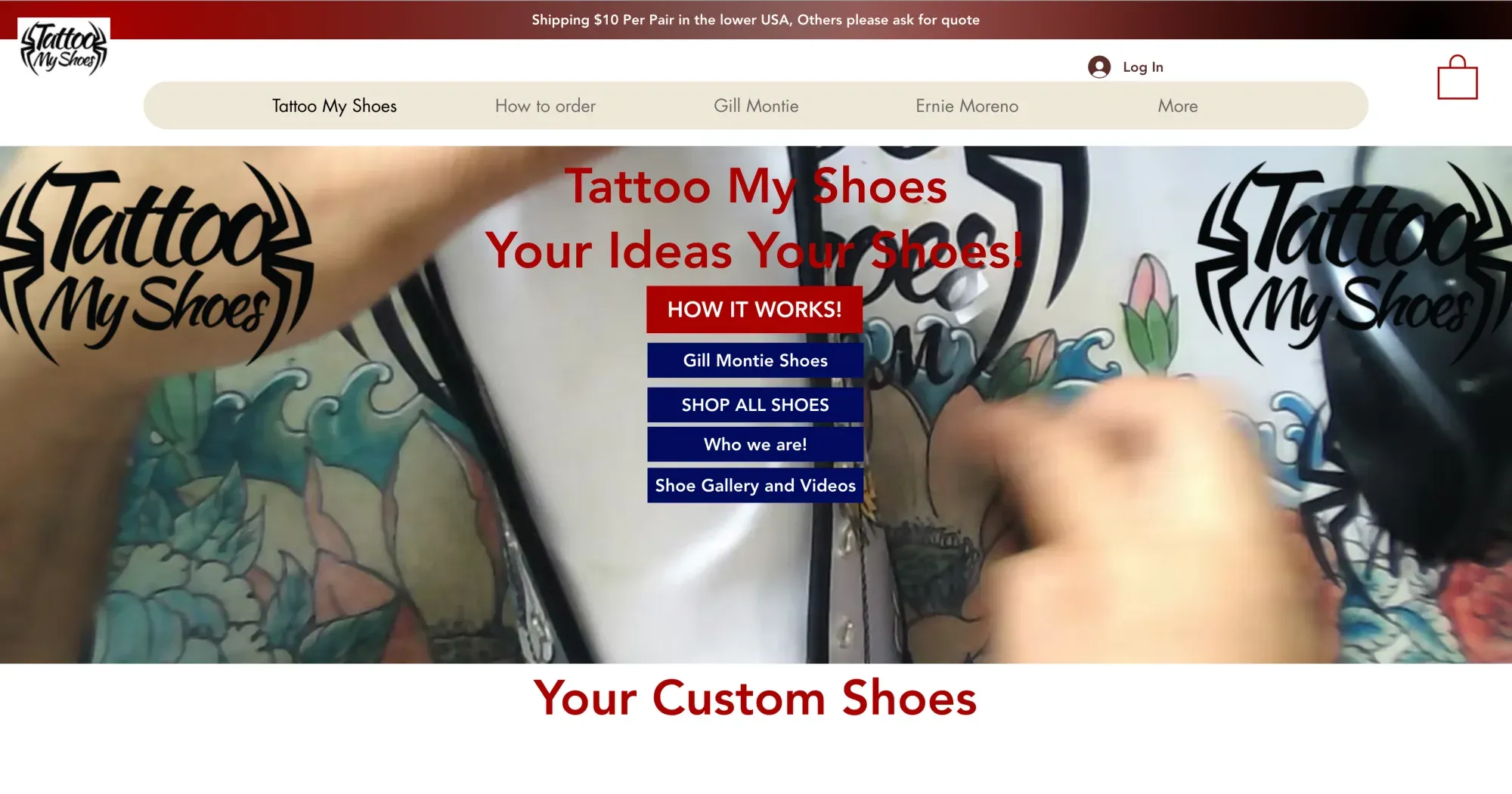
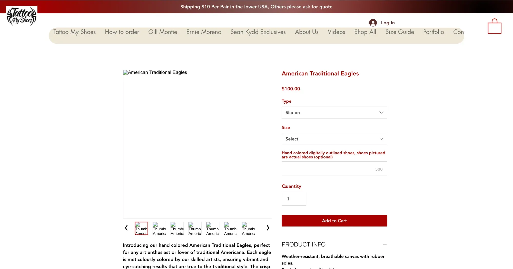
Both frames are the Wix store as it stood before the rebuild, captured at the same viewport.
Performance
Forty seconds is not a metric. It is a closed shop.

Observed LCP, old storefront
Observed LCP, old storefront: 40s to Largest Contentful Paint, at worst.
to Largest Contentful Paint, at worst
At its worst the old storefront took somewhere between 40 and 50 seconds to reach Largest Contentful Paint. Read as a Lighthouse score, that is a technical debt item. Read as a customer, it is a door that does not open.
Nobody waits that long to look at art. The visitor never sees the design, never learns there is an artist behind it, and never reaches the point where any merchandising decision could have done its job. Every other problem on this page was effectively invisible, because almost nobody stayed long enough to meet it.
So speed was not scheduled as a clean-up phase after the redesign. It was the precondition for the redesign being worth doing, and it became a constraint on everything built afterwards: how much imagery a page could carry, how the catalogue was rendered, and what was allowed to load before a customer could interact with anything.
The journey
Customers could reach a product. Nothing helped them choose one.
The rebuild started from the customer's sequence rather than the site map. Not "how should this page look", but: what does someone need to understand first, how do they find a style they like, how do they get from a piece of artwork to an actual pair of shoes, and what stands between that and a purchase?
On the old store, the product page was where that sequence quietly broke. A customer arrived at something they liked and was then asked to configure it through options that did not explain themselves — fragmented choices, no sense of what each one changed, and no confidence that the thing in the cart was the thing they had pictured.
We treated that as a decision problem rather than a layout problem. Customisation was sequenced in the order customers actually decide, each choice was made legible at the moment it is made, and the information that removes hesitation — what you are buying, whose artwork it carries, in what form — was moved in front of the Add to Cart rather than below it.
What the journey was designed against
- 01What does a first-time visitor need to understand before anything else?
- 02How do they find a style, and then the artist behind it?
- 03How do they move from a piece of artwork to a product they can buy?
- 04Which choices do they have to make, and in what order?
- 05Where does confusion turn into an abandoned cart?
- 06What information gives them the confidence to commit?
The purchase path, before and after
Before
04 steps
- 01LandIf the page ever finished loading.
- 02ProductReached by scrolling one flat grid.
- 03Configure?Options that did not explain themselves.
- 04ExitNo way to tell what was in the cart.
After
06 steps
- 01DiscoverMore than one entrance to the catalogue.
- 02ArtistThe person behind the design.
- 03ArtworkA body of work, not a filter result.
- 04ProductThe artwork, as something wearable.
- 05CustomiseSequenced in the order people decide.
- 06BuyWith the reassurance above the button.
More steps. Fewer unanswered decisions.
Six steps rather than four is not more work for the customer. It is the same purchase with the decisions separated out, each one made where there is room to explain it.
Drag to compare
Old product page → Rebuilt product page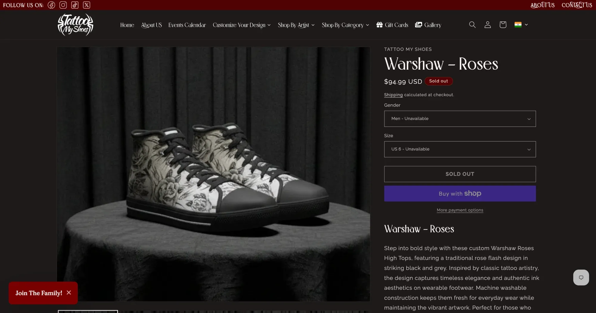
The rebuilt product page: the artwork at full width, the artist named above the title, and the choices sequenced beneath it.
The same step in the journey, before and after. What to look at is the order the decisions arrive in and how much each one explains itself — not the styling.
What changed on the product page
- 01
Clearer visual choices
Each option shows what it does to the thing you are buying.
- 02
A decision hierarchy
The choices arrive in the order a customer actually makes them.
- 03
Customisation made visible
The configuration is legible at the moment it is set, not after.
- 04
Reassurance above the button
What you are buying, whose artwork it carries, in what form.
- 05
Fewer options on screen at once
Deliberately. A configurator that shows everything decides nothing.
The turn — artists
Discover by artist. Explore the work. Then choose the product.
For TattooMyShoes, artists are not metadata. They are the product, the brand story and the commercial model at once — and on the old store they were effectively invisible, with every design flattened into a single catalogue that gave a customer no reason to go any deeper.
The rebuild gave artists and their collections a real place in the architecture. Someone who likes one design can see the rest of that artist's work, read a collection as a body of work rather than as a filter result, and move from artwork to product without losing the thread they were following.
That is a discovery change and a merchandising change in the same move. It gives the catalogue more than one entrance, it gives returning customers a person to come back to instead of a search box, and it turns a flat grid into something worth exploring.
On a phone
Where most of this audience actually shops.
Tattoo culture lives on phones, and so does this store's traffic. A forty-second load and an unclear configuration flow are both worse on a small screen, where there is less room to explain a choice and far less patience to wait for one.
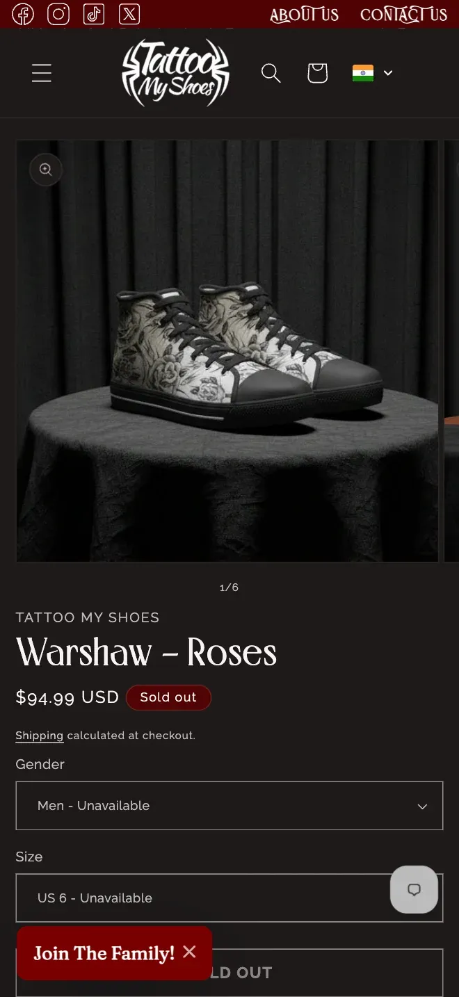
The phone experience was designed as its own composition rather than as a narrowed copy of the desktop one: the same journey, with the artwork given the room to be the thing you look at, and the decisions stacked in an order that survives a thumb.
What the customer saw
The same store, narrowed.
Why it mattered
A slow load and an unclear choice both cost more on a phone, where there is less room to explain and less patience to wait.
02 / Decisions
Three decisions did most of the work.
Fix the storefront's speed before designing anything on top of it.
What it cost
Nothing else could be judged while the page took the better part of a minute to appear. Working in this order cost us the comfortable early weeks of showing visual concepts, and it asked the client to fund work they could not see. It also meant every design decision after it was made against a store that behaved like a store.
Treat the product page as a decision, not a layout.
What it cost
Customisation was rebuilt around the order a customer actually chooses in, which meant deliberately putting fewer options on screen at once. We gave up the look of a rich everything-at-once configurator, and the team gave up some freedom to drop new options anywhere on the page later.
Make artists structural, not a tag on a listing.
What it cost
Artist, collection, design and product became distinct things the store understands rather than words attached to a product. Adding a product now takes more care, because someone has to place it in that structure — and that cost is exactly what makes artist-led discovery and per-artist commercial reporting possible at all.
03 / System
None of this works as a separate project.
A fast store nobody can navigate is still not a store. Each piece below was designed against the ones next to it, and each one is holding the others up.
- 01Performance
Rebuilt first, then kept as a constraint on every page designed afterwards — imagery budgets, how the catalogue renders, what loads before a customer can interact
- 02Buyer journey
Discovery → artist → artwork → product → customisation → purchase, designed as one sequence rather than as six separate templates
- 03Product experience
Customisation sequenced in the order customers decide, with each choice explained at the point it is made and the reassurance moved above Add to Cart
- 04Discovery
Artist and collection surfaces as genuine entry points into the catalogue, not filters applied to a single grid
- 05Ecommerce architecture
Artist, collection, design and product modelled as distinct objects the store understands, rather than labels on a product listing
- 06Commercial visibility
That same structure is what turns "which artists and collections are selling" into a question the business can actually ask of its own data
04 / Result
Better for the customer. More legible for the business.
Since the rebuild, TattooMyShoes has been seeing materially stronger visitor activity and sales than it did before — the thing the business had been trying to reach for a long time. The exact figures are the client's to publish, and we are not going to manufacture proxies for them here.
What we can describe is what changed structurally. A storefront that used to take most of a minute to become usable now lets a customer reach the artwork. A customer who reaches the artwork can follow it to the artist who made it. A customer who finds a product can see what they are choosing before they commit to it. And the catalogue is modelled so the team can ask which artists, which collections and which designs are carrying the store.
That last point is the difference between a redesign and a foundation. The work changed what the store looks like, and it changed what the business is able to see about itself.
For the customer
- The storefront becomes usable in time to reach the artwork
- Artists and collections are entrances, not filters on one grid
- Each customisation choice explains what it changes, in the order it is made
- What is being bought is stated above Add to Cart, not below it
For the business
- Artist, collection, design and product are objects the store understands
- A sale can be attributed to the artist and the collection behind it
- Which designs are carrying the catalogue becomes a question with an answer
- Performance is a standing constraint on every page added from here
Measurement note
Only figures we could confirm and measure the same way before and after are published here. Where a number could not be, the outcome is written out instead.
In full
TattooMyShoes came to us as a sales problem and turned out to be a system problem. The brief a business writes in that situation is usually “redesign the site”, and a redesign on its own would have failed here — a faster page still would not have told anyone who the artists were, and a beautiful product page still would not have made the customisation flow decidable.
So the engagement was scoped across the whole experience rather than as a sequence of independent services. Performance, conversion strategy, buyer journey, interface design, product configuration, discovery, catalogue architecture and commercial measurement were treated as one dependency graph, and the order of work followed that graph rather than the order that would have produced the earliest screenshots.
The dependency that mattered most: performance gates everything above it, architecture gates everything below it. Speed is what gets a customer to the artwork. Structure is what lets the artwork lead somewhere — to an artist, to a collection, to a product with choices a person can actually make — and it is the same structure that later lets the business see which artists and which collections are earning their place in the catalogue.
That is why the artist work appears twice in this case study: once as a customer-experience change, and once as a business-intelligence one. It is a single architectural decision with two payoffs, and it is the clearest example of why the project was scoped as an ecommerce system rather than as a set of services we happened to perform in the same quarter.
Where this leaves you
Is your store hiding its own product?
We look for the friction between what you sell and how customers actually decide to buy it.
Send us the URL. We will tell you whether the problem is the speed, the journey, the product decision or the architecture underneath them — and which one is worth fixing first.
Not ready to talk? Book an audit and we will put the findings in writing first.
Keep reading
All case studies